Image Compositing with AI: What It Can Do (and What It Can’t)
AI image compositing sits in an interesting gray area. It isn’t traditional photo restoration, and it isn’t pure imagination either. Instead, it tries to answer a more tentative question: if you give an AI several imperfect photos of the same person, what can it reasonably infer about how that person looked?
When it works well, the results can feel a little uncanny. They’re cleaner, clearer, and more lifelike than any of the original photos. But when we misunderstand what’s happening, those same results can easily be mistaken for recovered truth.
By recovered truth, I mean visual information that actually existed when a photograph was taken and can be reliably retrieved. Maybe it was captured but obscured, or maybe a better copy exists somewhere. Traditional photo restoration works in this space. AI image compositing generally does not.
This post is my attempt to understand what AI image compositing actually does, where it works surprisingly well, where it clearly doesn’t, and how to look at the results without reading more into them than they deserve. I’ll ground the discussion in a concrete example comparing outputs from Google Gemini Nano Banana Pro and OpenAI ChatGPT Image 1.5.
What AI image compositing really means
AI image compositing is not about recovering lost detail. Once information is gone (blurred away, damaged, or never captured) it can’t be brought back.
What these tools do instead is look across multiple images and try to identify what stays consistent from one photo to the next: overall head shape, relative feature placement, proportions, and recurring asymmetries. From those shared signals, the AI generates a new image that fits what it thinks it has learned.
The result is best thought of as a plausible likeness, not a restored photograph. It may look more realistic than any single source image, but it’s also more interpretive.
That distinction matters, especially when working with historical or family photos.
Why low-quality photos can still be useful
Even badly deteriorated photos often preserve basic structure. Fine detail may be gone, but proportions usually remain. How wide is the face? How are the features spaced? How is the head shaped?
When you have several such images, those weak signals can reinforce each other. Random noise gets averaged out, while what’s consistent becomes easier to detect. That’s why multiple poor photos can sometimes be more useful for compositing than a single “better” one.
Still, there are limits that no prompt or tool can get around.
The limits you can’t escape
Missing information is always invented. If a feature never appears clearly in any source image, the AI has to fill it in with something reasonable, but not verifiable.
Averaging is unavoidable. When the AI is unsure, it tends to drift toward what looks typical. This can quietly smooth away distinctive traits.
Time and age get simplified. If photos span years or decades, the AI may normalize age and texture unless explicitly told not to.
Realism increases confidence, not accuracy. A sharp, studio-style portrait can feel more “true” than a grainy original, even when it’s more speculative.
These aren’t flaws so much as characteristics of the approach.
The example: from fragile snapshots to a composite
To see how this works in practice, I ran the same compositing task through two different AI tools.
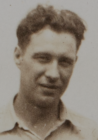
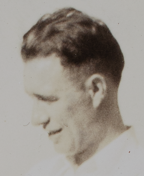
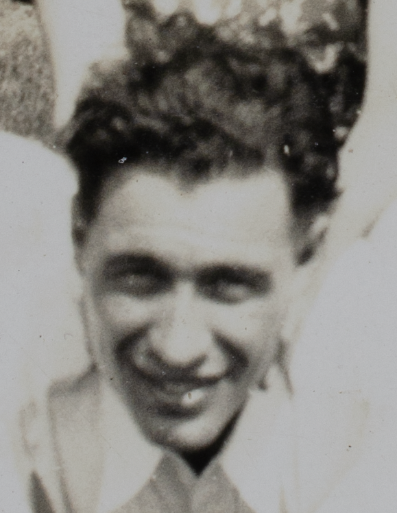
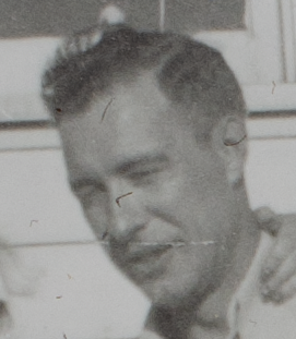
The starting material is intentionally challenging. I used ten cropped headshots taken from a collection of 2×3 snapshot photographs from the early 1930s. The originals are typical of the era: small prints, limited detail, uneven lighting, and visible deterioration. None of the individual headshots would support meaningful enlargement on its own.
This makes the task a test of compositing rather than restoration. There’s very little fine detail to work with, and what information does exist is scattered across images.
The question isn’t whether the tools can “fix” these photos. They can’t. The more interesting question is whether, given several weak inputs, they can extract enough consistent structure to produce a believable composite. One that feels internally coherent and plausibly connected to the source material.
One additional detail is worth noting about the starting images. The original snapshots were digitized using a DSLR camera-based scanning setup rather than a flatbed scanner. This approach captures as much detail as possible from small photographic prints, often outperforming consumer scanners in sharpness and tonal range. The individual headshots used in this experiment were then carefully cropped from those high-quality scans at the best practical resolution.
Before cropping, some minimal cleanup was performed on the scans. Primarily white balancing and very light tonal adjustment to correct for aging and color shifts in the original prints. No retouching or detail enhancement was done. The goal was simply to present the AI tools with clean, faithful representations of the source images, not to improve or reinterpret them.
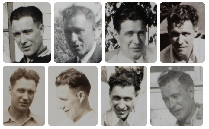
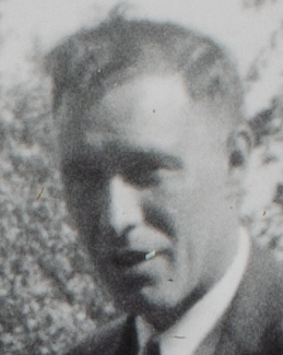
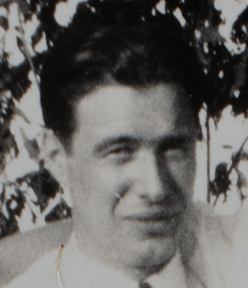
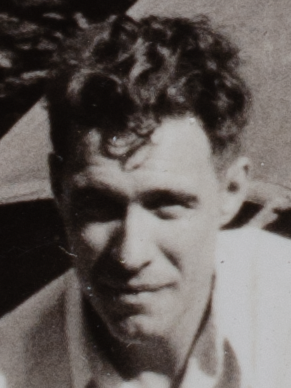
Cropped headshots
Below are the 10 headshot images used for the compositing.

The prompt: setting clear expectations
Both tools were given the same set of cropped headshots and the same prompt. The wording is intentionally explicit. Not to game the models, but to be clear about what I was asking for, and just as importantly, what I wasn’t.
At a high level, the prompt asks the AI to treat the images as evidence of identity rather than material for cleanup or enhancement. The goal isn’t to improve a particular photo, but to look across many imperfect ones and infer what remains consistent.
Here is the prompt exactly as used:
1
2
3
4
5
6
7
8
9
10
11
12
13
14
15
16
17
18
Using all provided reference images, create a single composite portrait representing the same person.
Infer stable facial structure by comparing the reference images collectively.

Prioritize consistent features such as bone structure, facial proportions, eye spacing, nose shape, jawline, and overall head shape.

Ignore transient factors including lighting differences, photographic defects, blur, grain, dust, expression, and minor pose variation.

Render the subject at approximately the median apparent age across the reference images.

Preserve natural asymmetry and individual imperfections. Do not beautify, idealize, smooth skin, or modernize the appearance.

Use a neutral expression (relaxed eyes, closed mouth), soft even lighting, and a plain, unobtrusive background.

The result should resemble a straightforward, realistic studio portrait intended to represent identity, not a restoration or enhancement of any specific source photo.

If uncertain, favor a more ordinary or slightly imperfect appearance over an idealized one.

Prioritize identity accuracy over sharpness, resolution, or visual appeal.
Every line exists to counter a common failure mode: over-smoothing, beautification, era drift, or confident invention. The prompt can’t eliminate guesswork, but it can encourage restraint.
Reading the results
Before looking at the generated images, it helps to reset expectations. These composites aren’t answers. They’re interpretations.
They show how each tool resolves ambiguity when information is genuinely missing, and how confidently it fills in gaps that can’t be filled with certainty.
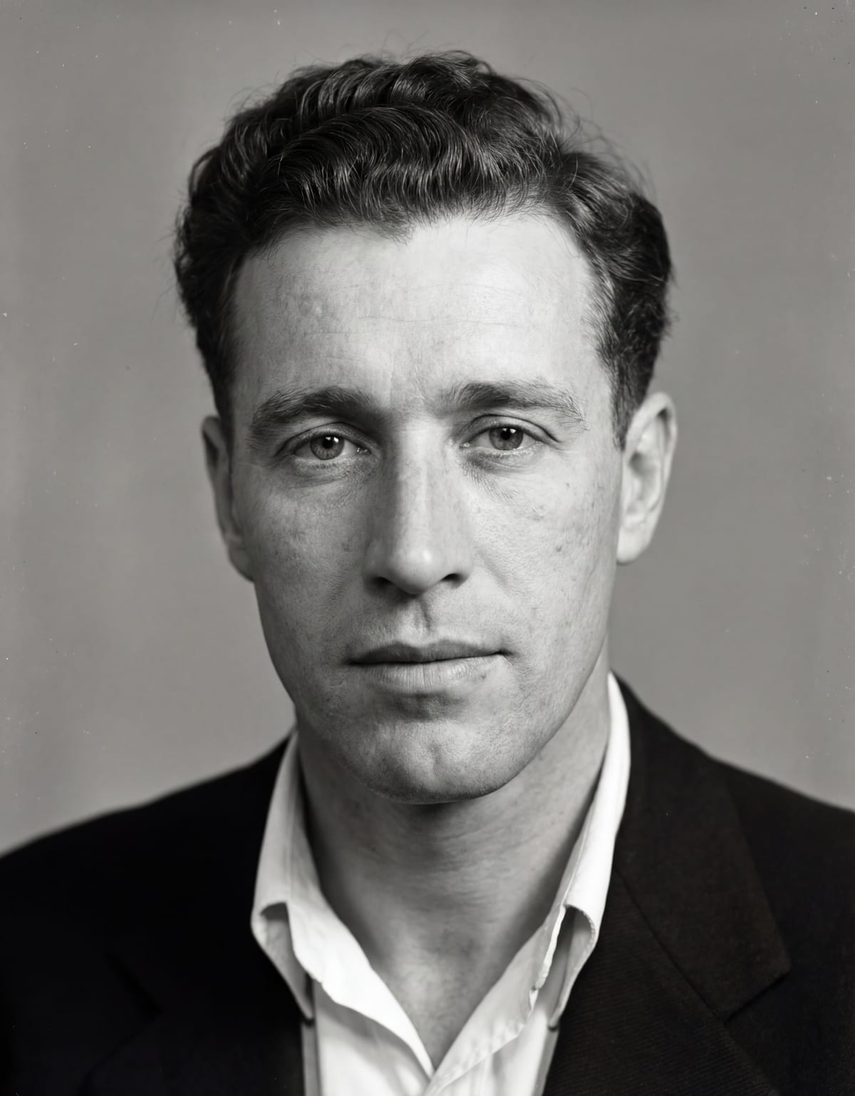
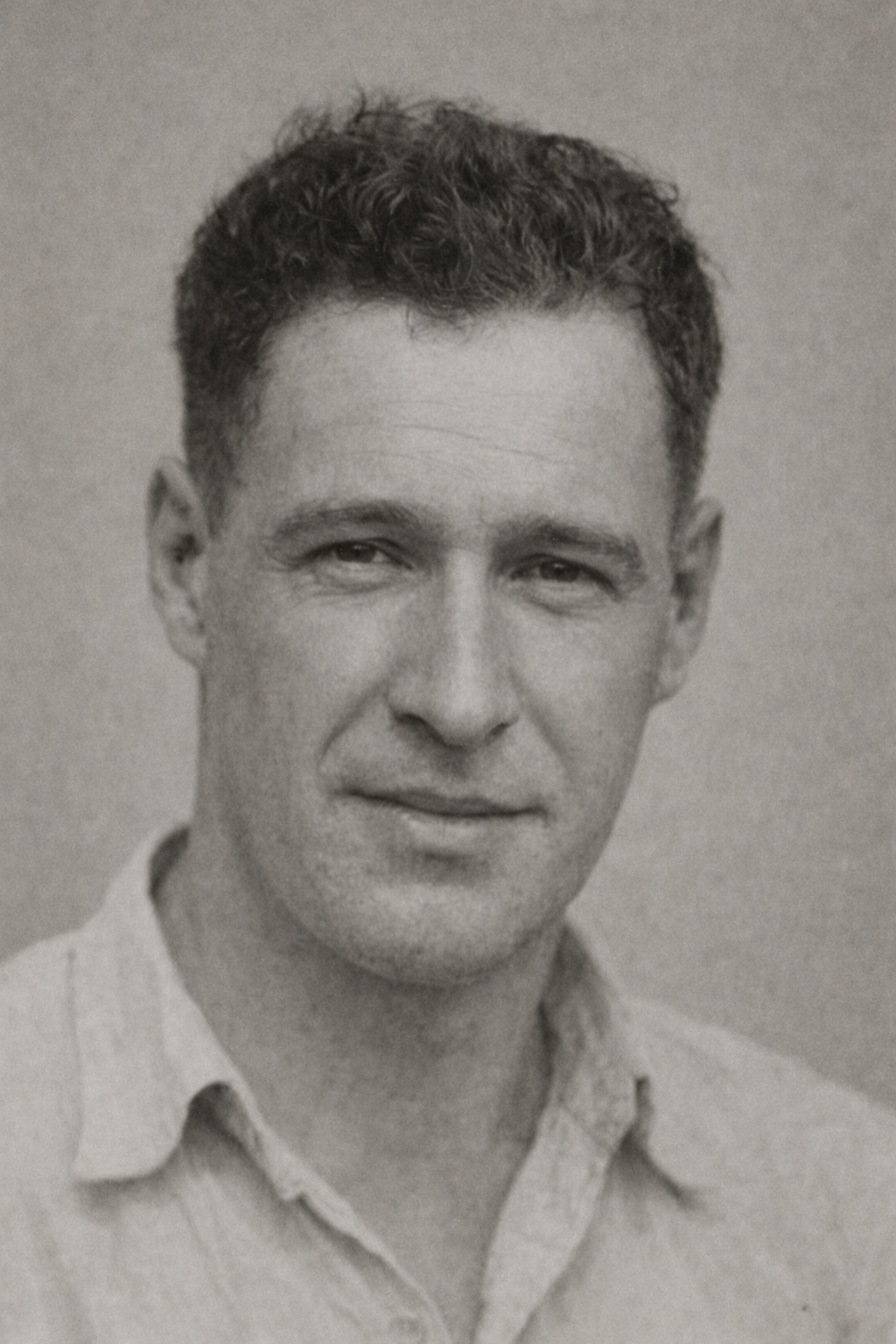
A note on the two composites
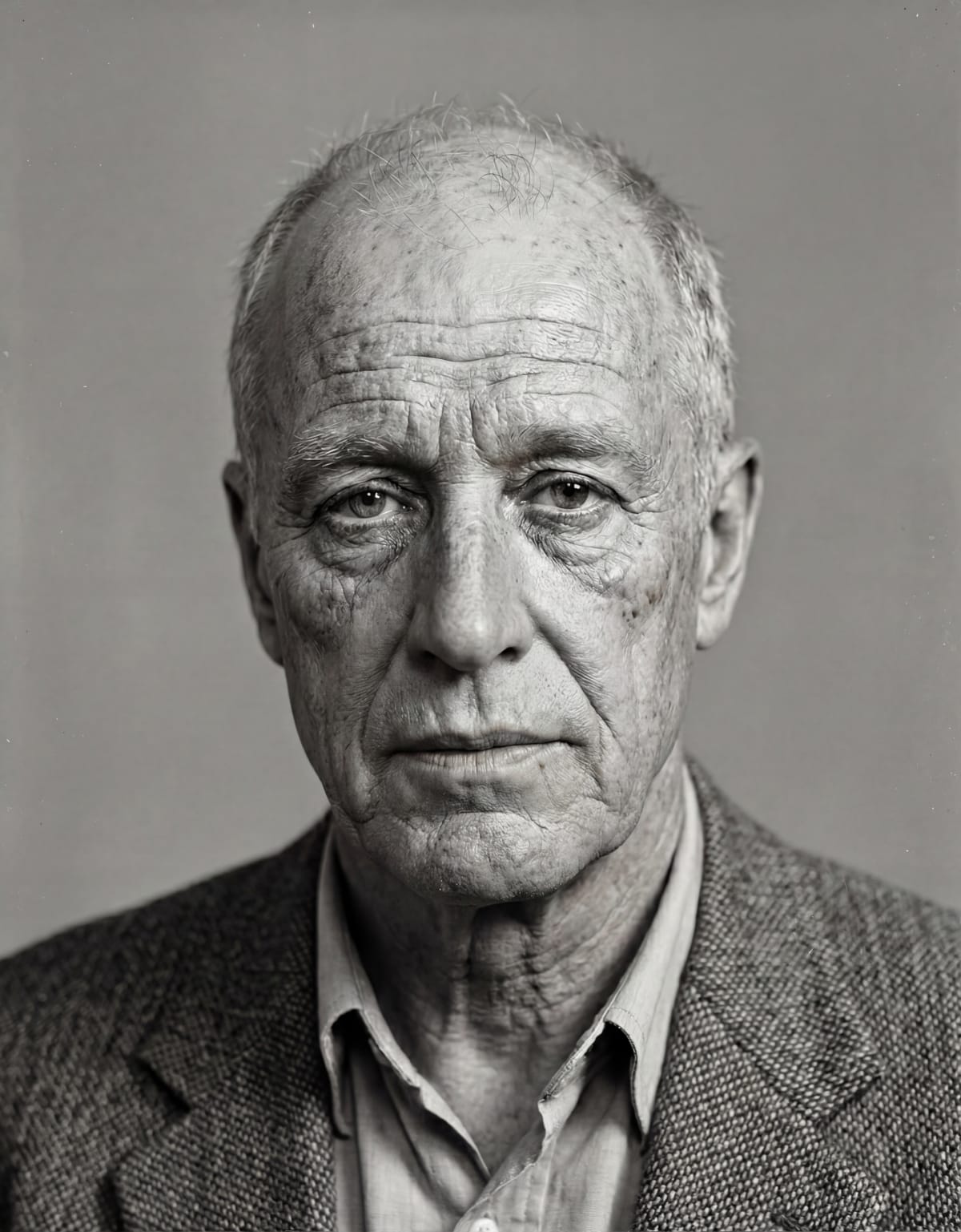
One of the most immediate differences between the two composites is how they feel as photographs. The Gemini Nano Banana Pro image is noticeably sharper and cleaner, with smooth tonal transitions and a modern, high-resolution look. It reads almost like a contemporary studio portrait: crisp, evenly lit, and visually confident. That sharpness makes the face feel very present, even though much of the detail is necessarily inferred.
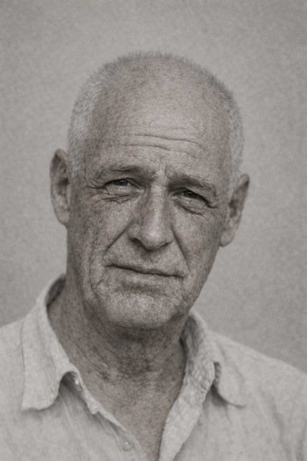
The ChatGPT Image 1.5 composite, by contrast, appears softer and grainier, with a texture that feels closer to older photographic processes. The image looks slightly faded and less precise, which gives it an “older” character overall. Whether intentional or not, that grain and softness make the result feel more historically distant, but also less exact in its depiction of fine structure.
Seen side by side, the contrast is striking: one image feels modern and photorealistic, the other feels archival and subdued. Neither necessarily tells us more about what the person actually looked like. But they strongly influence how confident and “real” the viewer perceives the result to be.
Taking it a step further: aging the composite
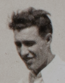
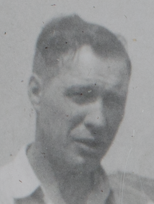
The original photos were taken when the subject (my grandfather) was likely in his early to mid-20s. That naturally raises another question: what happens if we ask the AI to age that inferred likeness forward in time?
As a follow-on experiment, I asked each tool to generate a new image showing how this person might appear at around age 60. I also provided a bit of context: that he had lost most of his hair, was a moderate-to-heavy smoker, and spent a good deal of time in the sun.
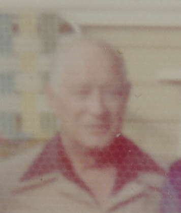
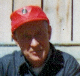
This is a much more speculative task. It doesn’t just involve filling in missing detail. It requires guessing how a face might plausibly change over several decades. To ground this a little, I do have two real photographs of my grandfather from around that age. They’re still low resolution and imperfect, but they provide a loose point of comparison.
This comparison highlights a simple but important risk. If an AI-generated image happens to resemble a real photo from later in life, it’s easy to assume the AI “got it right.” But resemblance alone doesn’t mean accuracy. It may just be a reasonable guess that happens to line up.
When the image doesn’t resemble reality, it’s tempting to conclude the approach doesn’t work at all. In practice, both outcomes reflect the same thing: the AI is making informed guesses based on incomplete information.
The key point is that realism is not the same as truth. An image can look convincing without being something that was ever actually known or recorded.
Final thoughts
Working through these examples has made one thing clear to me: AI image compositing is best understood as a tool for exploration, not confirmation. It can take fragments of visual information and assemble something coherent and believable, but it can’t tell us what was truly there when the shutter clicked. What it produces is a well-informed guess, shaped as much by the model’s assumptions as by the source images themselves.
That’s why realism is such a double-edged sword here. The sharper, cleaner, and more photographic an image looks, the easier it is to trust it. Even when it’s built on inference rather than recoverable fact. As the tools improve, that tension will only grow. Better models won’t eliminate the caveats. They’ll make them more important, because the results will be even harder to question at a glance.
Used carefully, though, this kind of compositing can be genuinely valuable. It can help visualize possibilities, explore family history, or better understand what might be inferred from incomplete archives. As long as it’s clearly framed as interpretation, not evidence. Keeping original images alongside composites, being open about how the images were created, and resisting the urge to over-polish all help keep expectations grounded.
This is also a fast-moving area of research and development. The tools I used here will almost certainly look crude compared to what’s available a year or two from now. It will be fascinating to see how much more convincing these results become. And equally important to remember that greater visual fidelity doesn’t change the underlying reality. AI can get better at guessing, but it can’t turn guesses into recovered truth.
For me, that’s the most interesting takeaway. Not what these tools can do today, but how they challenge us to think more carefully about what images mean. And how easily “looks real” can be mistaken for “is real.”
One last, more personal observation. I don’t have any direct memory of what my grandfather looked like in his early 20s, so my reaction to the younger-age composites is based entirely on how well they align with the original source images. From that perspective, both models produced results that seem plausible—faces that feel consistent with the structure and character suggested by the 1930s snapshots, without obviously inventing details that aren’t supported by the originals.
The aged composites are different. Here I’m relying both on the later photographs and on my own memory of what my grandfather looked like in his 60s and 70s. With that in mind, I think both models again did a reasonable job, but on balance the ChatGPT version feels somewhat closer to how I remember him. What surprised me was that if I had seen the aged ChatGPT composite without knowing how it was generated, I might have gone a step further and wondered whether it was actually a real photograph of my grandfather. That reaction doesn’t mean the image is more accurate, but it does highlight how easily a well-rendered composite can cross from “plausible likeness” into something that feels like recognition.